Durex Sensory Stories
Sensory storytelling for global packaging and marketing.
- Client
- Durex
- Role
- Design intern
- Engagement
- Agency (Havas)
- Dates
- 2019
- Team
- Havas London
- Scope
- Research and art direction of sensory storytelling concepts
Challenge
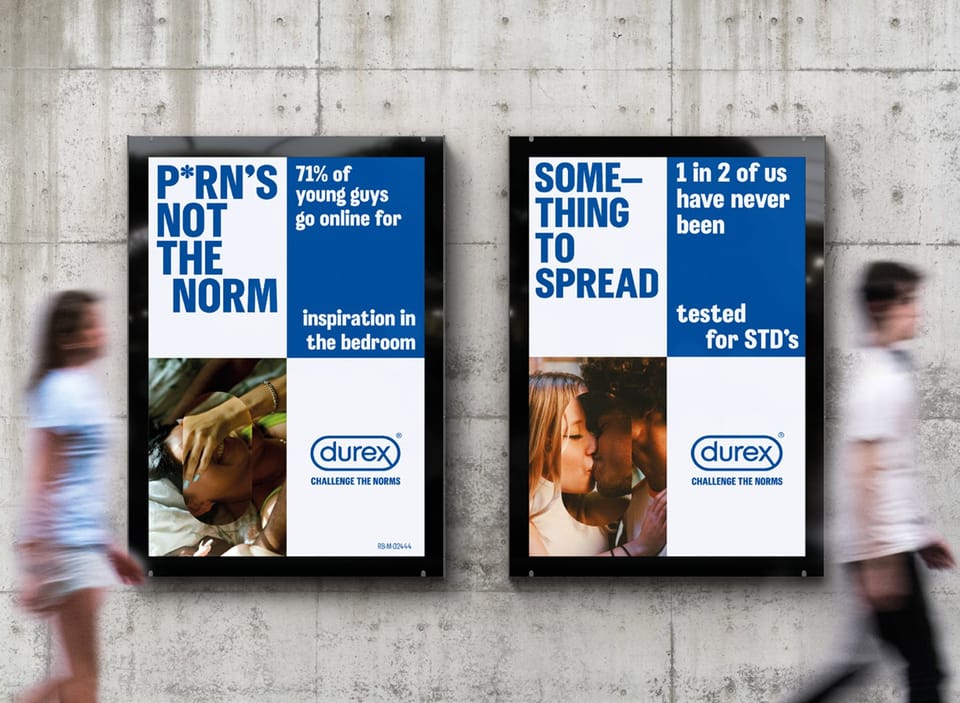
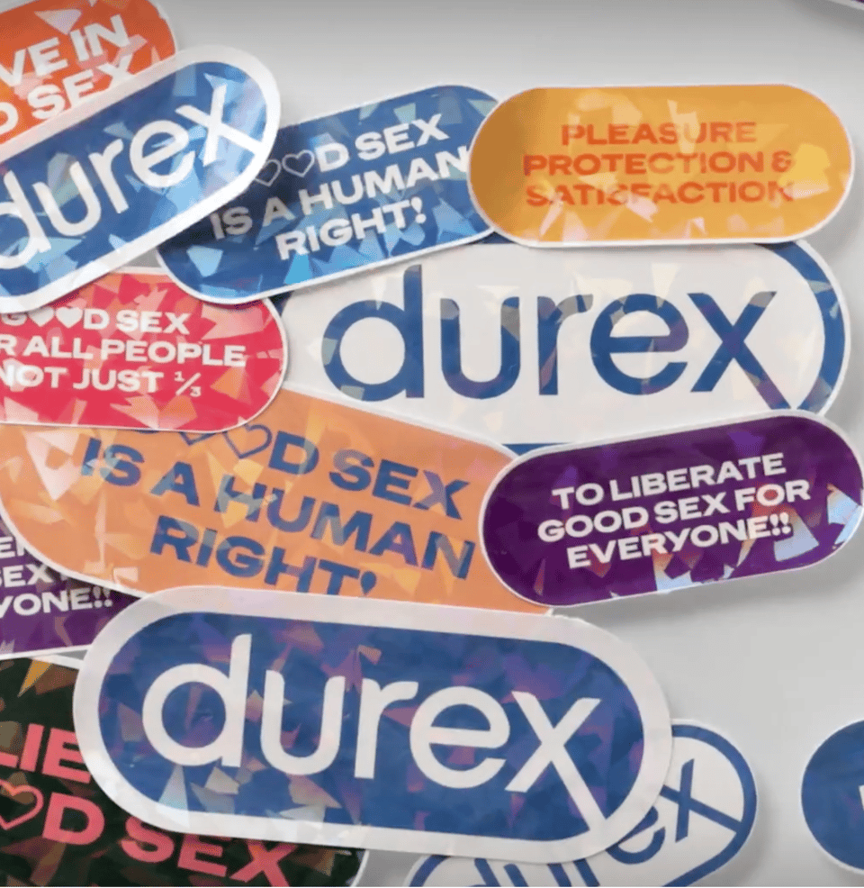
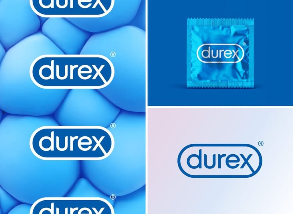
Durex’s global rebrand introduced a new visual identity, a custom typeface, Midnight Sans, and a new manifesto. The challenge was to give that identity a more candid view of intimacy, while finding a visual language for the different sensations and qualities of its products.
My role
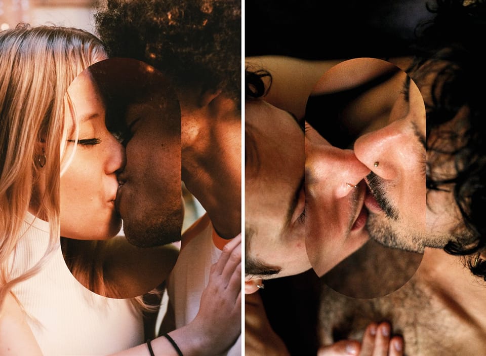
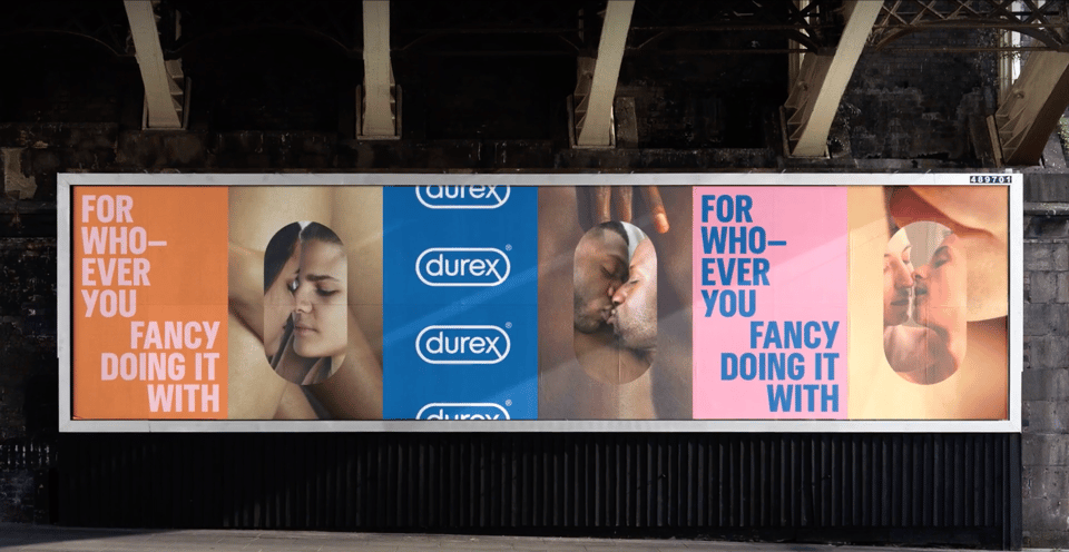
At Havas London, I supported the rebrand through image research and art-direction development, working with the Head of Design. I helped find photography that reflected a more modern, raw and real brand: real people in everyday settings, with intimacy that felt observed rather than staged.
Approach
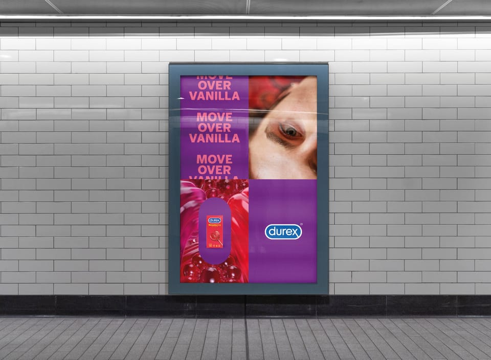
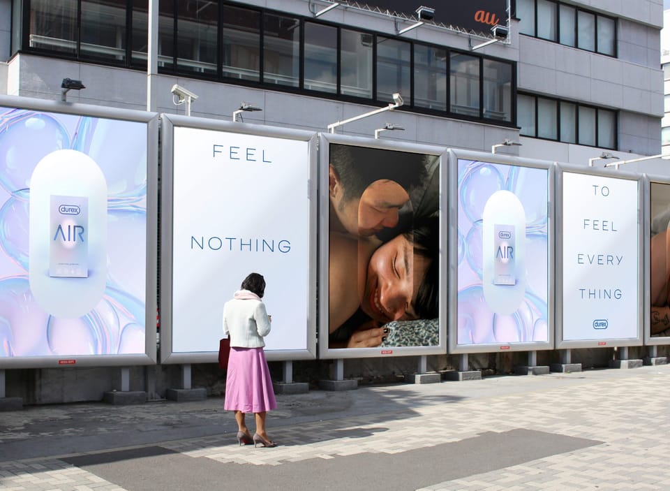
The Durex lozenge became a framing and cropping device, drawing attention to intimate moments. My image research supported that direction, looking beyond polished models and studio settings.
For the product imagery, I helped translate written sensory stories into briefs for the 3D agency. This included colour directions and visual references to help the agency express each product’s qualities through its sensory world.