Kaluza
A new brand, a design system and an in-house design function, built within a year.
- Client
- Kaluza
- Role
- Design Lead
- Engagement
- In-house
- Dates
- 2025–Present
- Team
- In-house team
- Scope
- Logo, brand, design system, website
Challenge
The old Kaluza brand led with a dark, very corporate palette. As the company stepped up to define a new category, Energy Intelligence, it needed a look that was grounded in nature, calm and unmistakably energy tech, and that stood apart from an industry that tends to shout in neon.
My role
I was hired to lead the rebrand and then built the in-house design function behind it.
Approach
The brand
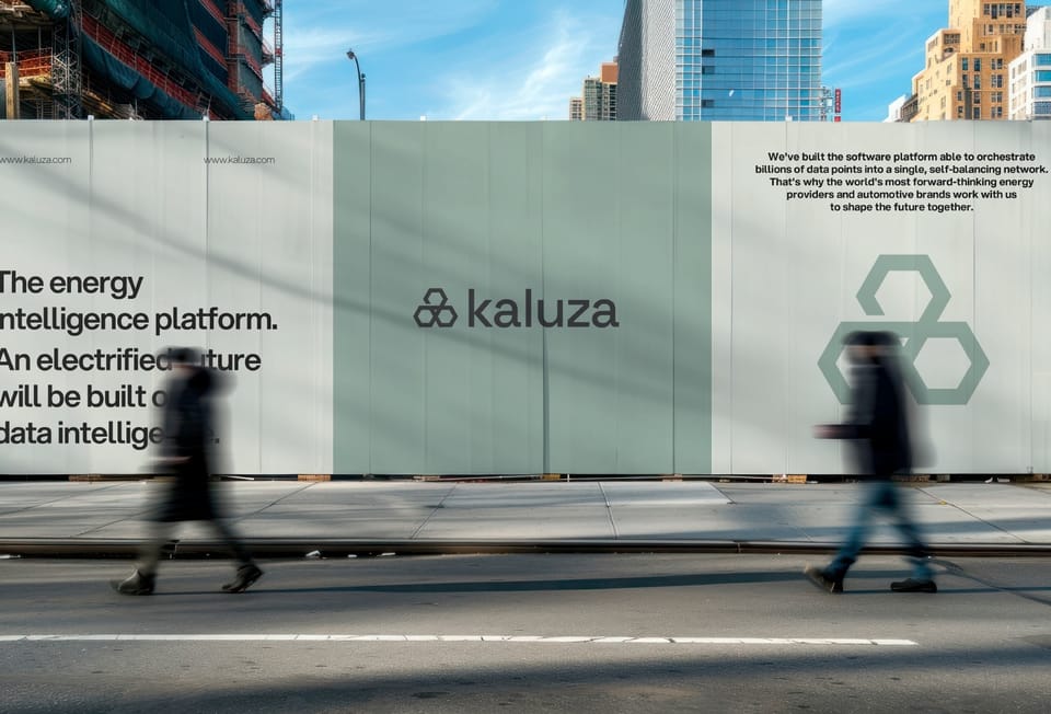
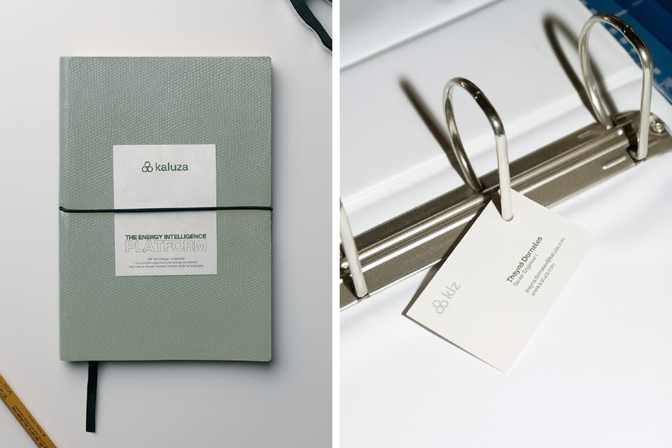
Rather than shout like the rest of the energy industry, the identity is built around "Grounded Intelligence": a calm palette of sage, glacier blue, sand and claystone that departs from the neon conventions of SaaS and utility branding. The logo is a trio of intertwined hexagons for suppliers, devices and the grid, with the space where they meet standing for the software that orchestrates them.
The system
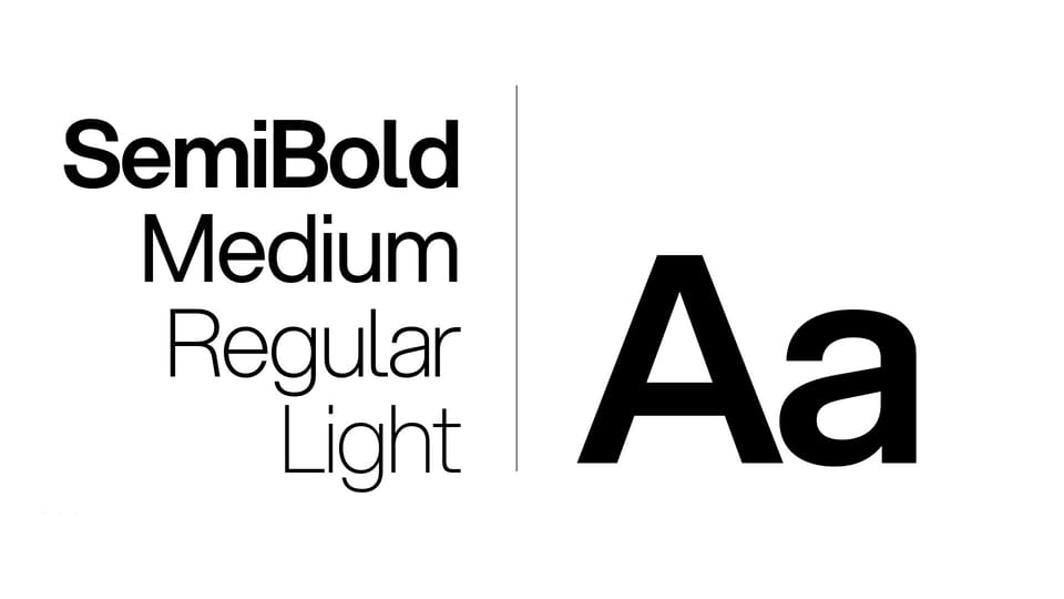
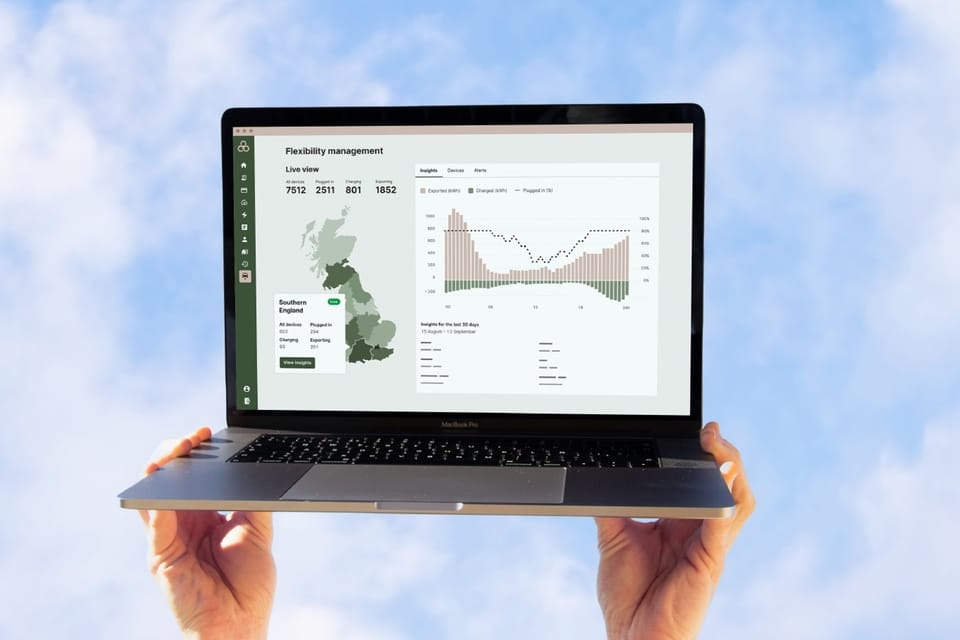
Restraint is the system. Aspekta, geometric in structure with a humanist warmth, carries the brand's voice through a tight weight hierarchy, from semibold headlines down to a feather-light annotation, always in sentence case and never shouting in caps. Every colour comes as a weighted five-step tonal ramp, so layouts get depth from tone rather than from extra hues. Photography is real Kaluza people, softly lit against nature-toned backdrops, never stock.
The function
To keep design from becoming a bottleneck as demand grew, I built self-serve design tooling, templates and Claude-based design workflows, so designers shape direction instead of producing every asset.
Results